PT
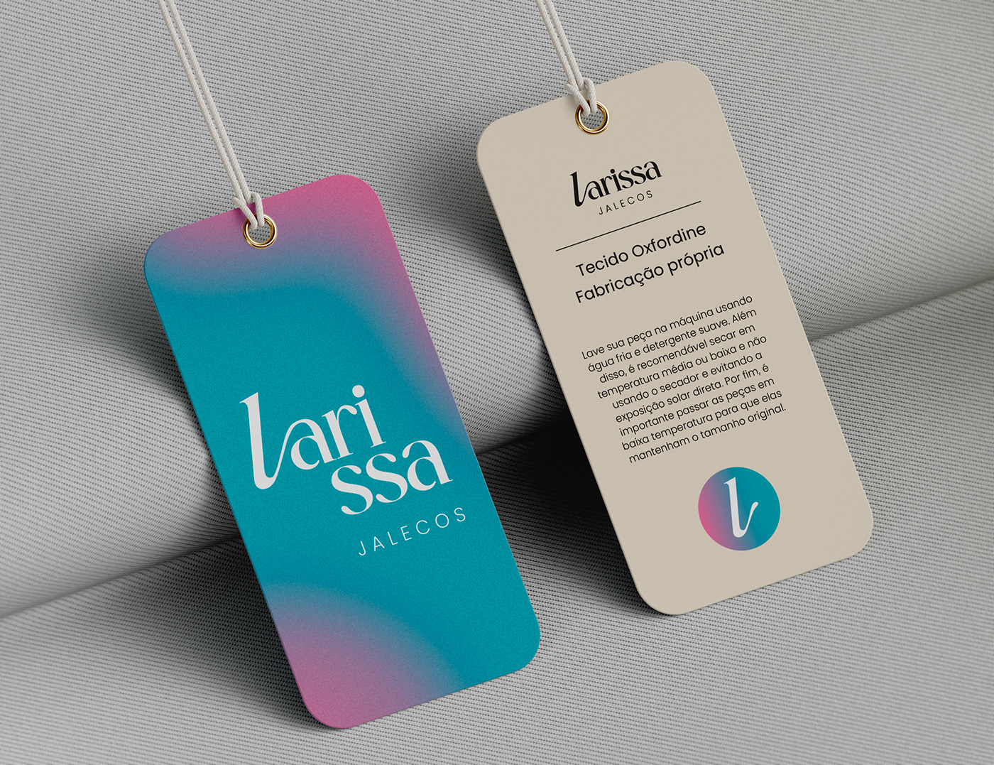
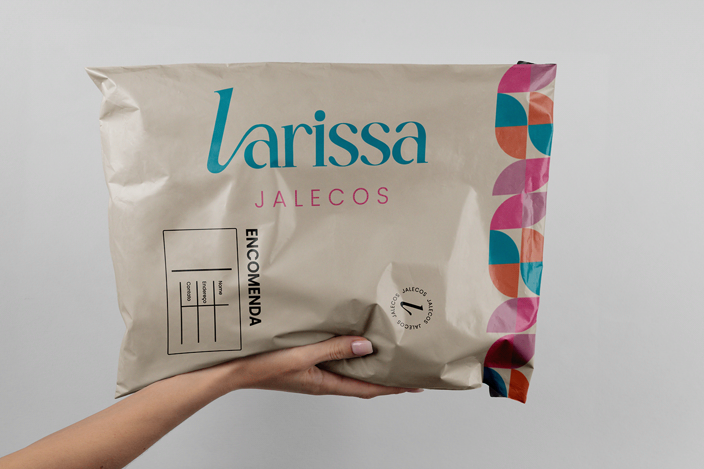
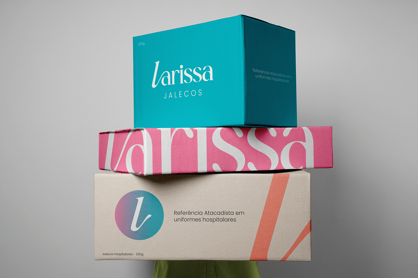
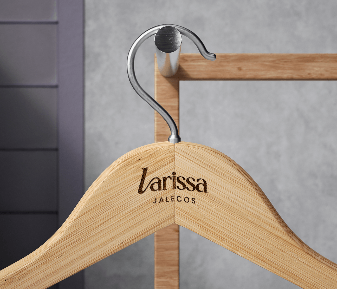
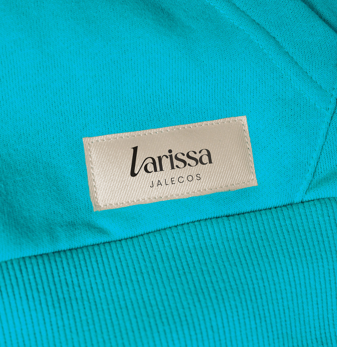
Para o rebranding da identidade visual da marca Larissa Jalecos, optamos por selecionar uma tipografia que harmoniza elementos clássicos através da inclusão de serifa, combinada com traços suaves que conferem uma sensação de jovialidade e alegria à marca. Além disso, a inclinação sutil do "L", entrelaçado com a letra “a”, confere um dinamismo e uma singularidade à tipografia ao mesmo tempo que preserva sua essência.
A nova paleta de cores retrata um momento de transformação para a marca, com cores que evocam tanto vivacidade quanto seriedade. Nosso propósito foi estabelecer a Larissa Jalecos como uma referência em comunicação visual no segmento de uniformes hospitalares, destacando sua unicidade no mercado.
EN
For the rebranding of the visual identity of the Larissa Jalecos brand, we chose to select a typography that harmonizes classic elements through the inclusion of serifs, combined with smooth strokes that impart a sense of youthfulness and joy to the brand. Additionally, the subtle slant of the "L", intertwined with the letter "a", lends dynamism and uniqueness to the typography while preserving its essence.
The new color palette portrays a moment of transformation for the brand, with colors that evoke both vibrancy and seriousness. Our purpose was to establish Larissa Jalecos as a reference in visual communication within the hospital uniform segment, highlighting its uniqueness in the market.